
Check Out These Concept Helmet Designs for All 32 NFL Teams
There aren’t many things more thrilling than watching an NFL game. While the action on the field is always highly entertaining, the designs of the uniforms and helmets can be a little boring and sometimes even weird. It’s no wonder fans want to see more innovative helmet designs.
For most teams, their helmet designs consist of just putting their standard logo on their team colors. It leads to some drab results. Why does it have to be that way? As you’ll soon see, there are plenty of creative people out there who have much better ideas.
Check Out These Amazing Designs
We’re going to check out two amazing designs for each team. You’ll then be able to decide which one you prefer and if it is better than the team’s current helmet design. Take it from us – whatever you choose will probably be much better than the one being used now!
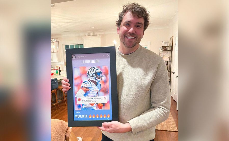
The first design you see is by designer Ted Hyman, who has many more great pieces of art on his Instagram page. The second design is a collaborative effort from the website Uni Watch. Let’s get started and check out these designs!
Tampa Bay Buccaneers
There’s not much to say here. Black and red is the best combination you can make, and the contrast just adds an extra dimension to the helmet. The design even extends to the facemask, making this top-notch concept both cool and characteristic of this aggressive sport.
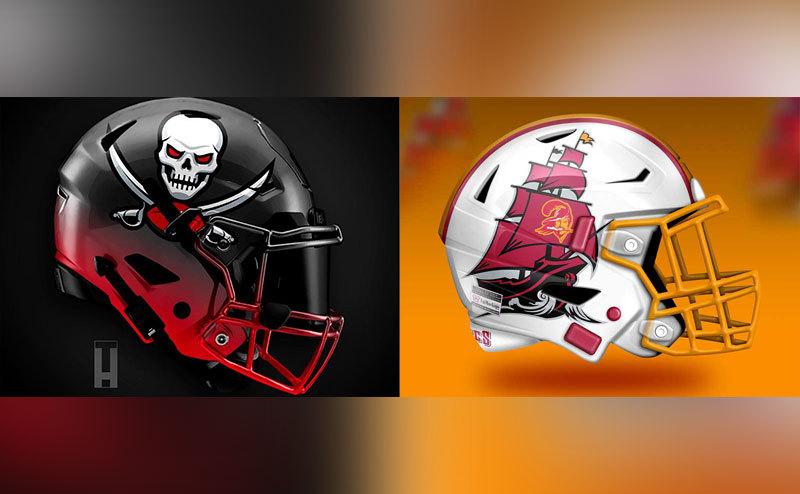
We’ve gone from one concept to an entirely different one in just one second. The gold and white helmet has the only design that can outdo the flaming skeleton. It has the whole pirate ship! Having the same shading as the first one is definitely the only improvement the design team can make – from an already perfect one, of course.
Kansas City Chiefs
When something is good, you should usually leave it that way. But there are a few cases where a bit of color can do a lot of good. With the Chiefs, it’s just better to leave the black and red combo alone since adding the gold finish cheapens it.
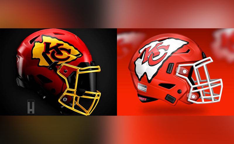
The color problem was somehow resolved in the second design but not so much for the logo. With a better display of color for the helmet, the weirdly shaped logo now seems just odd. We can’t take our eyes off of what looks like a huge mistake right in the middle. Maybe we need a combination of these two designs.
Green Bay Packers
Stripes are such an old, clichéd thing. You’d better go for something out of the ordinary if you want to amaze fans. In this case, the old theme is not the best, but enhancing the green-and-white design and simple logo improves the classic helmet design.
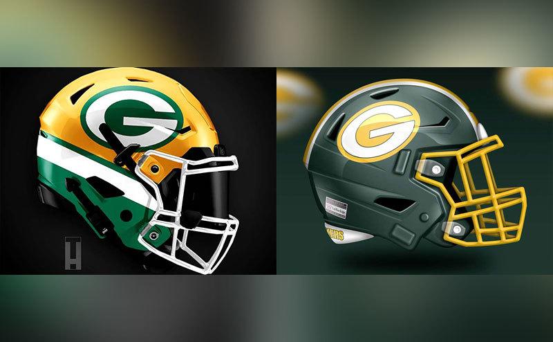
Well, this is a big improvement, even if the overall design wasn’t changed too radically. The helmet has a new concept with the shading and color, but it is still very similar to the classic Packers helmet. These designs are sure to divide opinion.
Jacksonville Jaguars
Jaguars are definitely something cool, and these helmets make the most of these majestic animals. Along with the trendy tones of blue is a brilliant design for the jaguar that will wow the team and the fans as well. We love the two-toned design of the facemask along with its overall aggressive look.
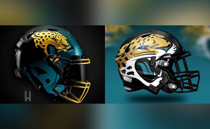
But if we’re talking size, maybe this is a little too much jaguar. The animal should take up a big part of the overall design but probably not the whole side! If it was just a little smaller, we might like this design a little bit more.
Tennessee Titans
This is for sure one of the best designs of all. The bright tones and use of flames are very fitting for the sport but also for the team. One thing we want to point out is the use of red. Maybe a full-on blue flame would have been a better choice. Either way, this one looks great.
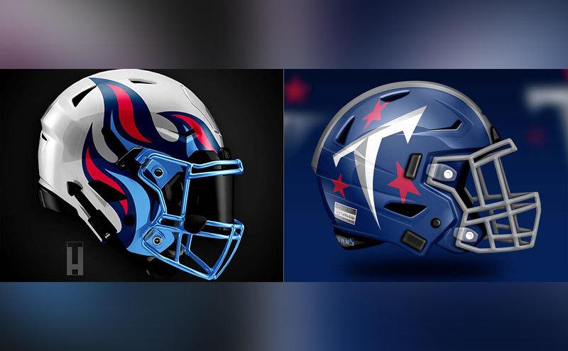
This one is not as good as the other design. We’ve gone from a daring design with cool flames that just scream power to a sort of cartoonish style T for the logo. This is not the best choice. In addition, the vibrant colors and all that good stuff were thrown out for this helmet design. What a disappointment!
Indianapolis Colts
This is an example of simple sometimes being better than a big design change. The classic helmet with the blue-and-white combo is iconic for the team. This design keeps the team’s traditional look while giving it a beautiful, modern design.
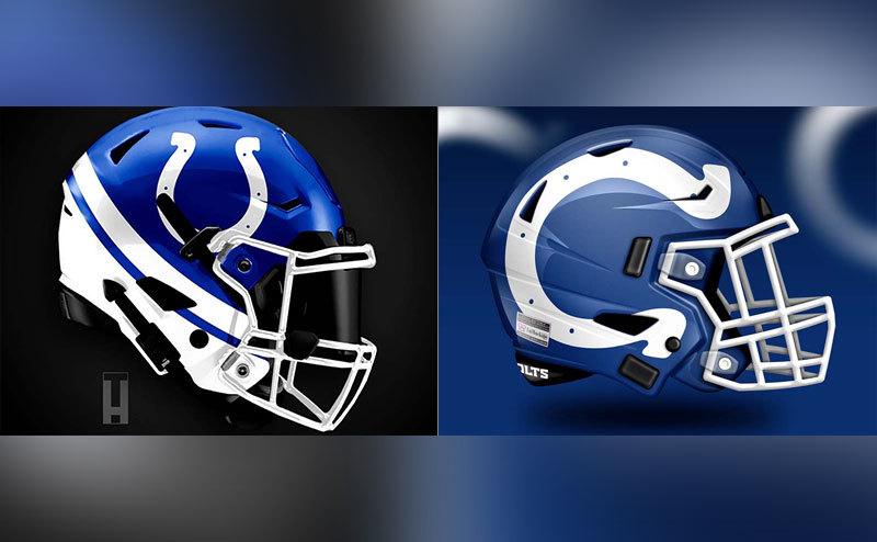
There is some ingenuity in this design. It has that famous horseshoe on it, but it has been turned on its side to resemble a “C” for the Colts. While it’s a good idea, in theory there is something about seeing that horseshoe turned the wrong way that just doesn’t look right.
Houston Texans
Sometimes the logo can be a huge part of the final design, and that is definitely the case here. Deciding to put the bull horns on both parts of the helmet is a huge win-win, and it gives that cool illusion that you’re looking at a charging bull on the field. The facemask could probably use a little upgrade.
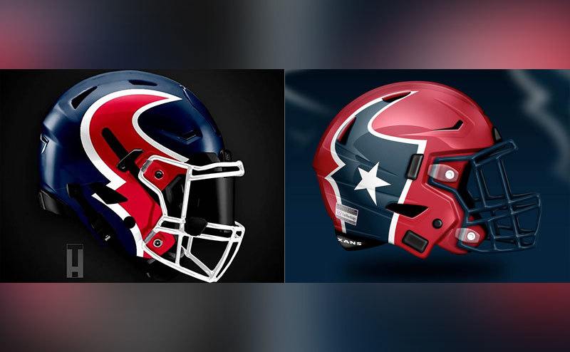
The second design kind of blows out the whole hype about charging bulls on the field and instead gives the team some puny looking horns and a bad position for the logo. It doesn’t improve anything about the overall look of the previous design. It has potential, but we’re not sure about this one.
New England Patriots
This feels like it’s almost a masterpiece, but it doesn’t quite connect. Surely the blue with some red-and-white stripes looks great, but the way they’re all thrown together just doesn’t look right. Some may love this, but others might feel it’s too busy.
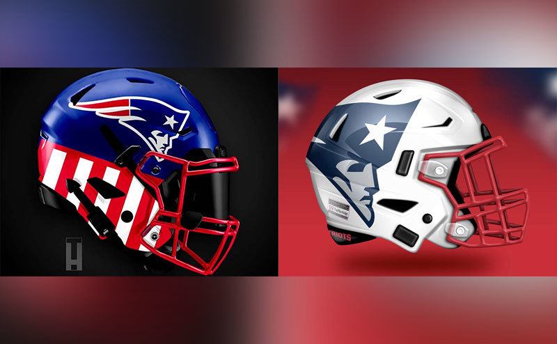
Now this is a big jump with a whole new thing going on. It is somehow modern and gives football vibes with the white giving it a clean, fresh design. The logo is out there more and easier for people to look at. While the first one is busy, this one is simple and beautiful.
New York Jets
The whole thing is confusing about this helmet with the logo in the back where it’s hard to see. It’s just a whole lot of things that don`t necessarily make sense together. It gives off more mini-golf vibes than any form of football.
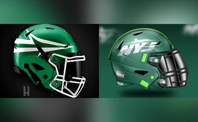
This one is a whole lot better with a cleaner design. You can actually see the logo and know which team you’re cheering for. The helmet is refreshing and very stylish. The only gripe here is that it looks quite a lot like a Packers helmet.
Miami Dolphins
At first glance, this is a breathtaking helmet, but soon you realize that the whole thing is way too much. And the bright colors are hard on the eyes. It makes a pretty picture, but this design looks a little too nice to be a football helmet.
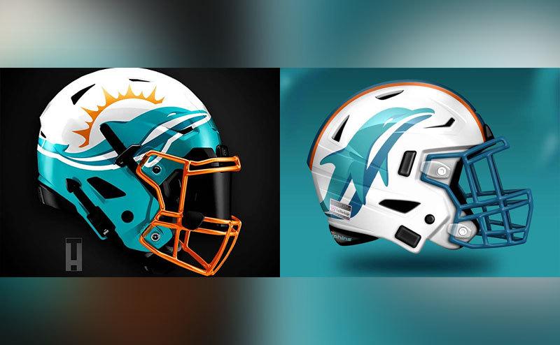
This is what we are talking about. It has a better spot for the dolphin so you can clearly identify the team and a much easier style for the whole helmet. Simple but catchy, this is the sweet spot for the creative design. It is more relaxed and spacious.
Buffalo Bills
Well, this is the only exception to the classic rule that simple is better. There is a lot on this helmet, but things seem to be just in the right place. There is a perfect balance with the red facemask, which makes it iconic for the team. This is a very cool helmet.
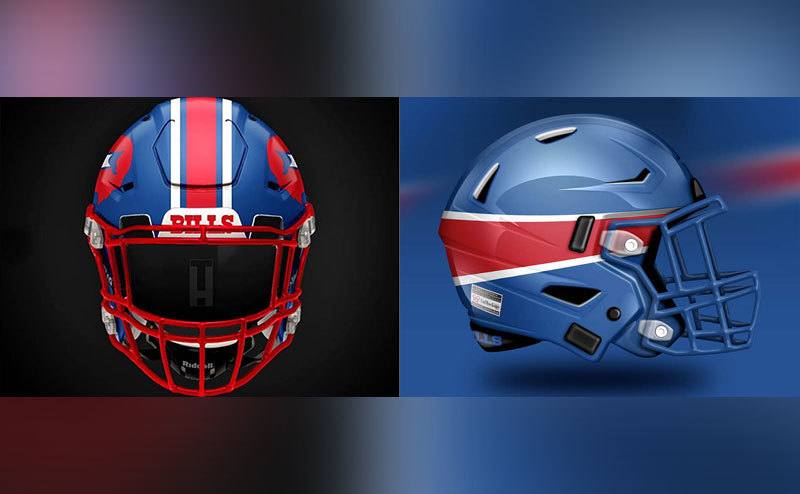
This is just bad and for sure the worst helmet of all. The whole thing is bad, from the color choice to the logo and design. It looks like someone got lazy and wanted to send a model out at the last minute. It’s not even worth talking about. Let’s just say there are kids out there with better bike helmets.
Cincinnati Bengals
Orange with dark stripes is just the thing we want. This design is definitely the wild tiger vibe that suits the Bengals and just screams menace on the field. The pattern is simple but effective. It gets the message out there, and fans live for it. The stripes look great on this helmet.
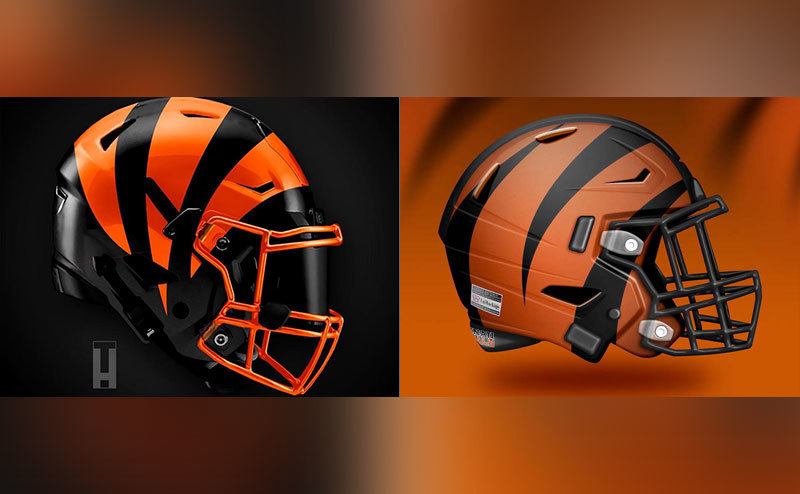
This is just the opposite of the first design. The tiger stripes are now calmer and a little dull. The quieter tone is a step back from the first prototype and puts the fighting spirit in a cage. This is just too peaceful, and the colors don’t look right here.
Pittsburgh Steelers
Here’s another example of a great all-time style. It has those traditional colors but uses them in a new way with the famous Steelers logo taking a proud place. The bright colors look vibrant when contrasted against the darker tones. It’s a mean-looking helmet, and we love it.
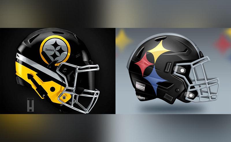
When you take a normal black helmet and stick a simple but somehow weird logo on it, that adds up to a boring combination. This is just too simple with nothing exciting except the random center line. The logo is weird as well and probably not aggressive enough for a football helmet.
Cleveland Browns
This is maybe a little too simple. The whole thing is, well, not good with its straight line and nothing to wow us. The number on the side is a nice touch, but the rest of the helmet is just humdrum.
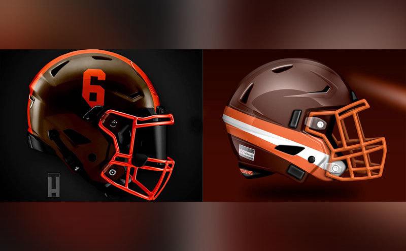
The second concept is just as bad – maybe worse. There’s nothing to look at here. The number that stood out before has been eliminated, and the weird line is accentuated on the side. Someone needed to put some more effort into making something new and exciting – perhaps add some exciting details and maybe use just a little bit of imagination.
Baltimore Ravens
If we’re talking about intimidation, this is the style to beat. The amount of dark color makes it stand out from the crowd. The logo seems well placed, and the smartly placed pattern around the bottom makes it stand out from most basic helmets.
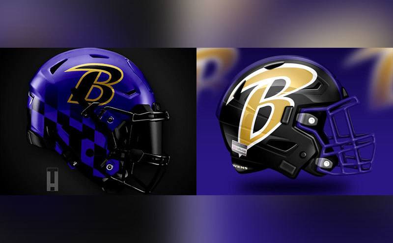
This second design must have been designed by a young child. The strong colors are faded, and the intimidation vibe is gone. It’s not a good style even though it has a lot going on with the big B. It’s not the best decision for freshening up the look.
Las Vegas Raiders
A black canvas is helpful if you want the monochromatic look, but it simply doesn’t do the job for this helmet. This is not the best, even though it still reflects the team’s legacy. In the all dark and white style, there could be a subtle pop of color somewhere, and we’re sure people wouldn’t complain.
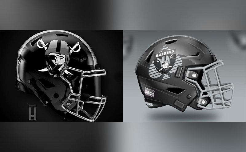
Not much is different in this second version except the muted color. But there is one huge added element that ruins the whole thing. What’s behind the logo? Is this football or Texas Hold ‘Em? There’s plenty you could do with the Raiders logo, but this is just a bad idea.
Denver Broncos
Nothing too much, nothing too little – this helmet keeps the old style but gives it a fresh look. It might make a good helmet, but there’s nothing to amaze anybody here. What helps is the beautiful Broncos logo that is quite simply one of the best in sports.
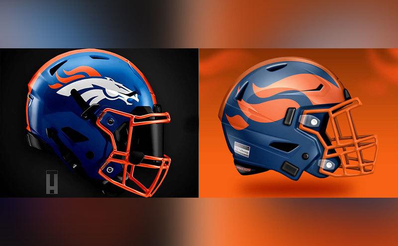
And here’s something more modern but still subtle, although the design could be bolder. Show a little courage and come up with a brilliant idea. Sometimes making a daring choice works out for the better. We miss the bronco on this design.
Chicago Bears
This is a fairly standard helmet design, but it works. These colors work perfectly together and create a great helmet. Maybe it’s not very imaginative, but it takes that classic Bears design and makes it modern and up to date.
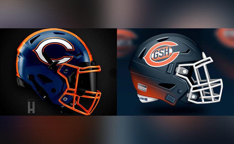
Something weird is going on in here, but we’re not too sure what. The logo change was a unique idea, but there are plenty more ways to do it. And what’s that GSH? Oh yeah, George Stanley Halas – the “Papa Bear.” But on the helmet? The gradients are cool but feel unfinished. Maybe somebody got a great idea but was stopped in the middle of making this helmet.
Detroit Lions
This is what I call a perfect use of a logo. The lion pops out of the helmet, and the electric blue, even on the facemask, just makes it great. The concept is cool and well-executed, and the energy is really there – something fitting for the Lions.
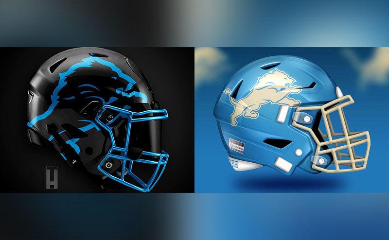
Wow! We’re not sure what there is to say about this style. It seems like the lion is now a plush toy on a baby blue background, and the only time we’ll see this helmet is when someone is running to the ice cream truck. Maybe the pastel color is kind of cute, but just for the record, “cute” doesn’t cut it when we’re talking football.
Minnesota Vikings
This first style has a bold idea with the bright gold and purple. The helmet has a lot going without being too out there. This is a daring helmet, and the results are a little mixed. Some people may love this, but we’re not too sure.
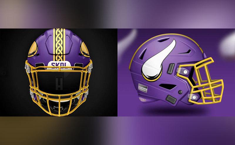
Look at the direction of that horn. It’s not quite in the right place and seems to be going in the wrong direction. We’re not sure the horn works so well since it looks a little silly instead of being intimidating. Overall, things seem a little weird. The style is fitting and gets the right message out there, but we’re not liking this design too much.
New York Giants
This is a good use of brilliant colors. The whole thing makes sense and is also pleasing to the eye. It gives off the right vibe, and the team logo is easy to see. The perfect use of lines here makes the colors pop. It’s a brilliant design.
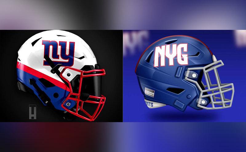
This is just boring! The cool tones leave a lot to be desired, and the NYG lettering looks a bit amateur. The randomly placed logo on plain blue definitely does not stand out. We much prefer the first design when it comes to the New York Giants.
Philadelphia Eagles
The color here just works. Metallic is a great look for any helmet, and with the help of the intense logo, the design doesn’t need anything more. The placement is right and gives the vibes of intimidating eagles swooping down on the field – just what fans want.
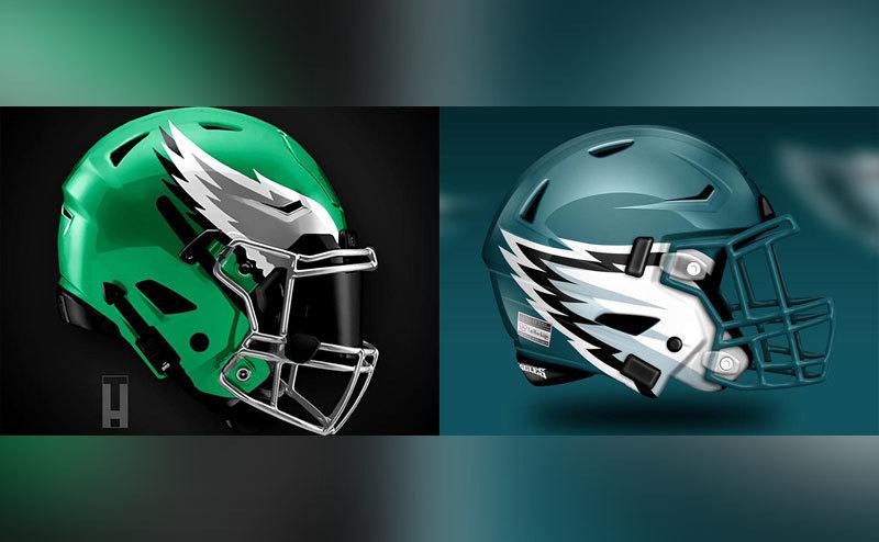
Somehow the color still works, but this time the placement of the logo is just random and gets mixed up with a bunch of fasteners and hardware. This is not good and probably not what we want to see. The eagle’s wings are low on the helmet and next to the facemask. It just doesn’t look right.
Dallas Cowboys
There are some cases where the design is so universal that you can’t do too much with it. This is the prime example – the big iconic star of the Dallas Cowboys that has been around since forever. The fans know it, and we don’t have a reason to complain. It’s simple but okay – not much going on.
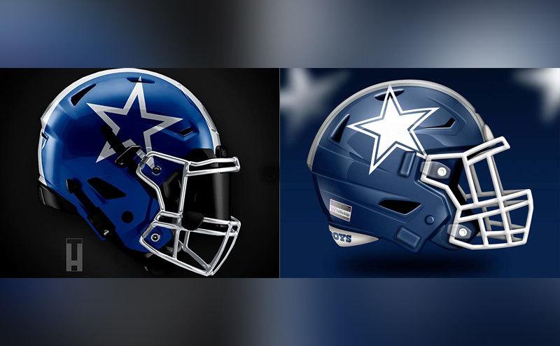
This is the same thing but with some minor color changes. The bold, white star seems to take up too much space and feels uncomfortable. The helmet has the same pattern and exactly the same facemask. Again, it is simple but acceptable – not the wow factor fans want, but it’s okay.
Washington Commanders
This is what we are talking about when we say bold. The combination of red, black, and gold along with the gradient gives the helmet a very cool look. It is perfect for any football game. The placement of the feathers is also spot on and gives the players a traditional look that is both stylish and strong.
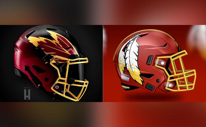
The second design is a plainer version of the first. It features exactly the same color scheme but lacks the boldness of the first design. This helmet seems more cartoonish, and the feathers just have no business being where they are. We think the first helmet is better.
Carolina Panthers
This is probably the only exception to the rule in terms of color schemes. A black panther on an electric blue base definitely gives the right vibes to reflect the whole team. The design is spotless, and the combination just makes sense. Maybe someone should try to make the logo bigger, but it’s still one of the coolest designs out there.
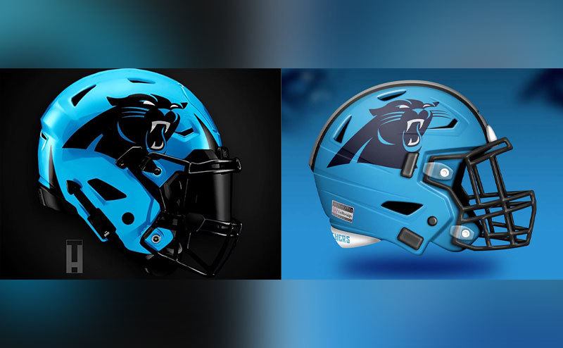
This second design seems less eye-catching. The electric tones aren’t there, and the panther kind of fades into the background. It’s exactly the same logo, but it doesn’t have the same powerful effect because there is no powerful contrast anymore. Very second-rate.
Atlanta Falcons
This is an old-school kind of thing for people who have known the Atlanta Falcons for a long time, and the design just works. The wings don’t look fantastic here, but the red-black combo gets the job done. Not too much and not too little – it’s okay to have something simple if that’s the best design.

This is an improvement with the entire falcon taking off to reflect the pride of the team. The white facemask gives the helmet a little bit of air, and the center line is designed to highlight the falcon in its glory. This is a well-made design.
New Orleans Saints
Now there is something weirdly endearing when you combine black and gold. It gives sort of a unique feeling. Some good things are going on with this design, but it’s not something that takes your breath away. The combo is good, and the logo looks brilliant, although a little strange.
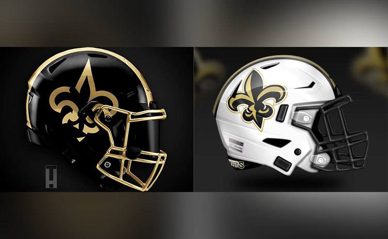
When you want to change things up, just change the color of the helmet. The bright white base gives out a new vibe, and the dark black facemask preserves the legacy of the team. The only problem here is the logo. It looks sort of big and maybe too much like a comic strip drawing.
Los Angeles Rams
This is just a missed opportunity to do something great with the team logo – a ram, after all. The overall aspect is weird, and the excessively big horns get lost on the helmet. It’s not the stand-out effect we wanted, but the colors are quite good.
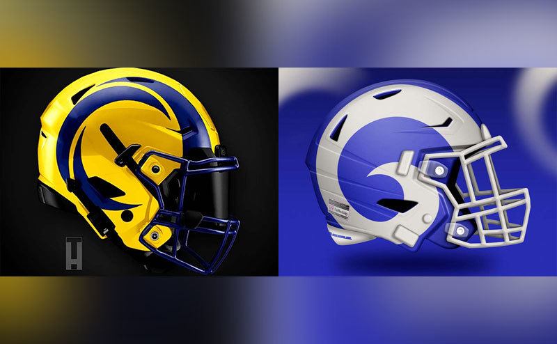
This second design is just so much worse. The horn (is that what it is?) seems childish and funny, and there’s not much to make it stand out. The ram’s horn looks like either Mary`s little lamb or an apostrophe. The calm, controlled design is not for the aggressive sport we want to watch.
San Francisco 49ers
The SF logo looks perfect on this helmet, and the color scheme is good. The electric tones make the helmet stand out and the logo pop. The simple yet brilliant design means this team is not playing around. This is a good design but maybe not the best.
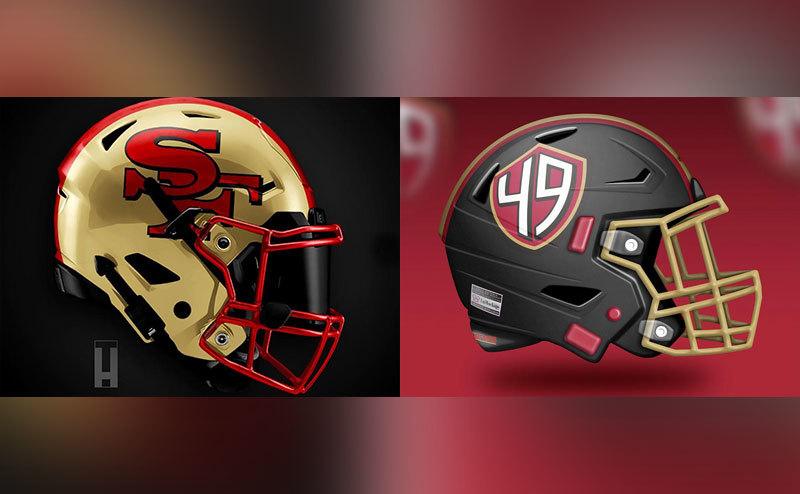
What about the logo in this second option? The logo SF is now 49 and trapped in a shape that’s in a weird position. There are a lot of things going on here with some red spots in random places and directions. The center line is cool but lacks style.
Seattle Seahawks
This first design could definitely be called a color blast. The green gradient is bold, and we can say it has earned points for courage. The logo is well placed and emits a perfect power vibe. But then the moment you look at the facemask, you realize this design could be a lot better. The weird, strong, electric green facemask is an eyesore.
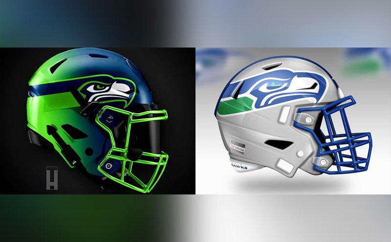
This second design is calmer, but is calm what the Seahawks want? It features the same logo although in pretty blue. It looks good and fresh with white tones, which is in bold contrast to the crazy color blast in the first helmet. Even though this helmet is reminiscent of an older version, the design is actually new and maybe even exciting. But is it perhaps a little too nice for a football helmet?
Arizona Cardinals
Now this is an interesting design. It features wings on the sides, a lot like some models we’ve already seen, but the thing they got wrong here is the size of the wings. They’re rather small and leave a lot of unused space in the back, almost making the helmet look bare with a simple white.
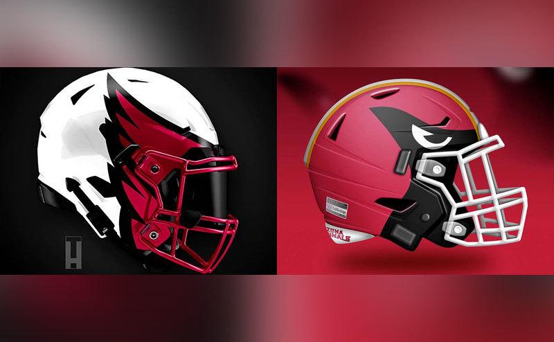
Yes, this is creative and there is plenty going on here, but the concept, although it has some potential, is just bad. Is this really a cardinal, and is that some sort of weird eye? Maybe this would make a good cartoon villain. This is another one that has potential but completely misses the mark.
Los Angeles Chargers
This is interesting, bright, and eye-catching. But we’re not sure about the size and placement of the logo. And what about LA? It’s partly covered up with the strap. Overall, it looks good, but there are some improvements that someone needs to make.
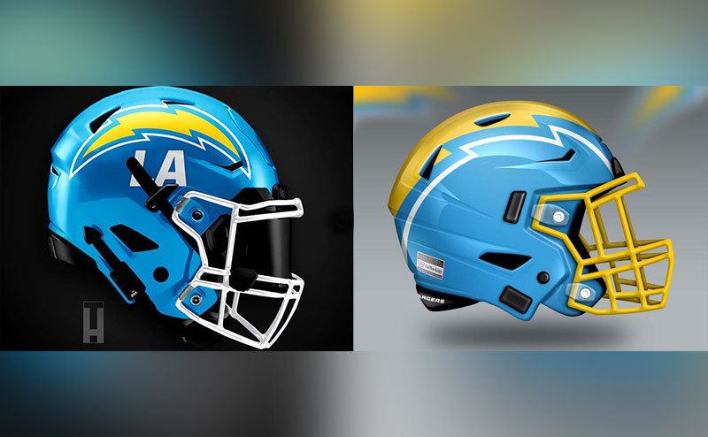
This second helmet brings back the old-style look. The logo that stretches throughout the entire middle of the helmet is a lot better than the first design and makes great use of the space and style. It’s not the boldest design we’ve seen, but we like it for its simplicity.